Several years ago I made a project for Year 4 children to make Julian Opie portraits using Paint.Net on windows PCs. This was relatively successful and a great number of students benefited from this as it’s a popular project for primary-aged kids.
This year I saw a new project in the hallways here at my school and mentioned the project we did as digital artwork. Due to the size of our school, doing anything ad-hoc is strict no, no. So I set about looking at our curriculum and working out where there is need for upgrading the understanding of layering and compositions.
Year 5 had recently begun using Photoshop on one of their projects (a remix of Paint.Net) and the next logical step would be to add a little bit of creativity to a ‘Cultures and Migration’ topic. So I set about looking at ways Adobe CC can be injected into the project. Julian Opie was on my mind and Illustrator too as this is his medium - as too the people who are in the images he creates (above) which fits the theme of ‘migration’. The other idea who uses an Illustrator-style of imagery is Patrick Caulfield who had his work displayed in the Tate during the late 1960s. Both, with a little bit a lateral thought applied, would lend themselves to cultures and migration.
Patrick Caulfield Coloured Still Life 1967
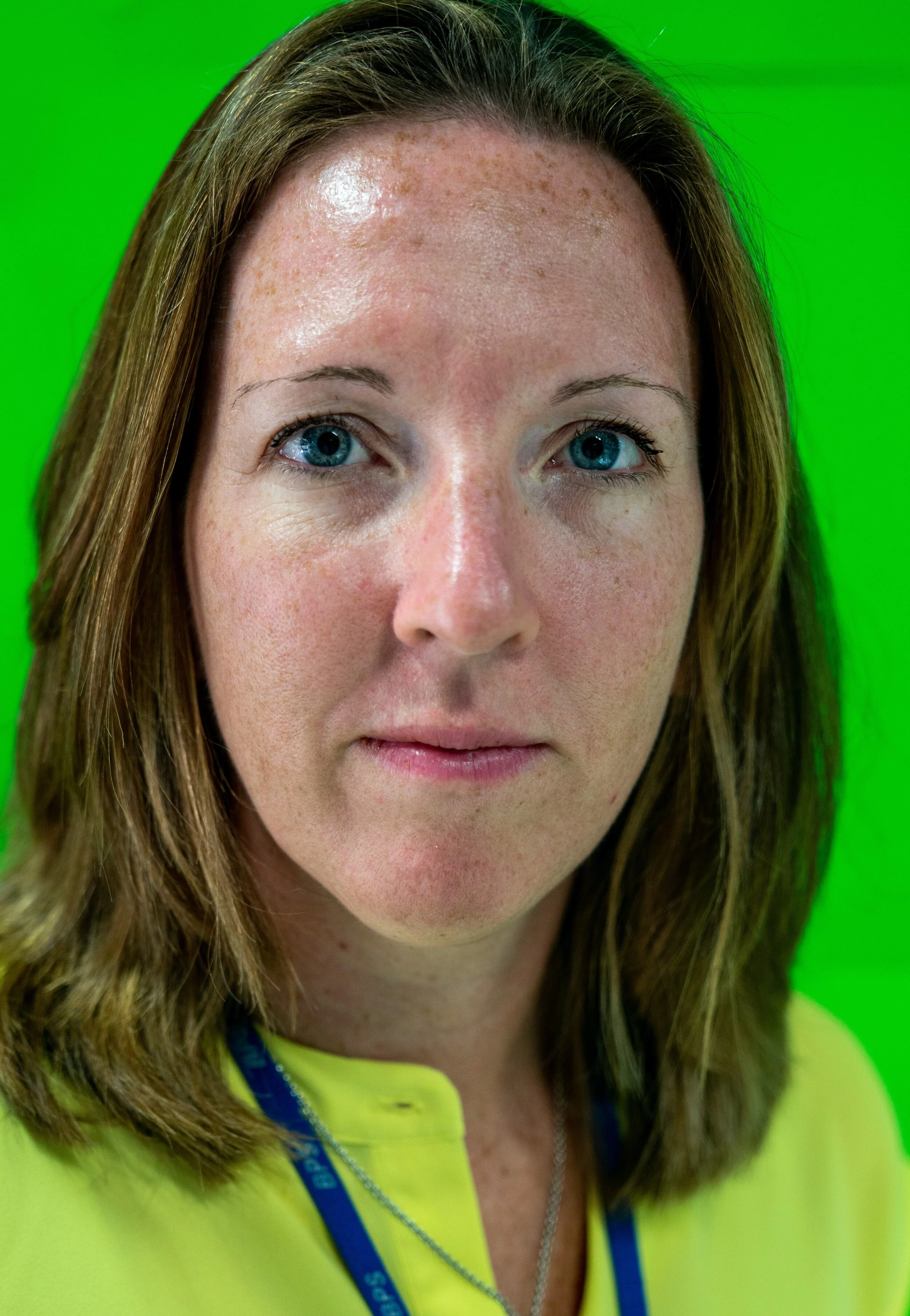
We set about taking portraits of the kids so that they had good quality images to work from and we asked them to bring props in to represent their culture or heritage. Some took this to a great degree as you can see from the sample of students below.
The goal was to let them get used to the tools in Illustrator, practice in the applitcation, work on their portraits and then build a composition as in the Opie image of the street scene above.
Part 1 of this series is to learn about the Pen Tool - arguably the most important part of Illustrator.
To start this process we played The Bezier Game at bezier.method.ac
The Bezier Game at bezier.method.ac
Next , is learning to manage Art Boards with the pen tools. Adobe have some outstanding resources for beginners.
Click to take you through to the Adobe Tutorials with the Pen tool and the resources here
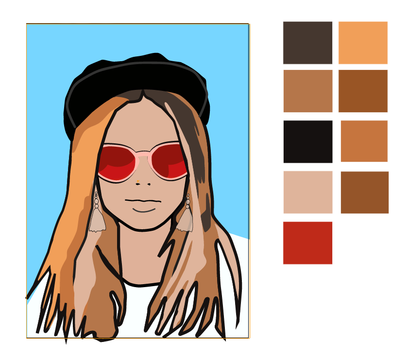
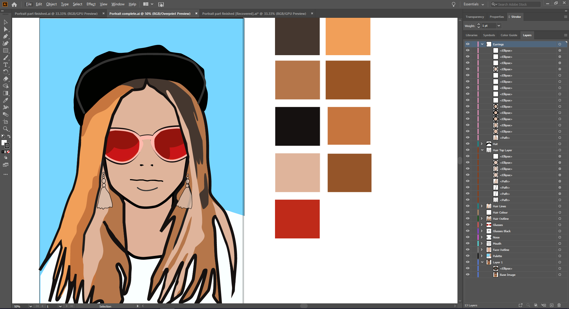
Once the kids have got familiar with the ‘strangeness’ of using the pen tool it’s time for them to import their images and begin tracing the base layers. Here in the examples, you can see how the base layers are edited with a colour palette and each aspect of the portrait is added as a separate layer: mouth, eyes, hair, outline, clothes and background colours.
The children followed their tutorials as in the playlist below. This is a series of about
To allow you to build up with this lesson along with the video here are the files:
Intro - Portrait from Unsplash.com
The final file (click here) in Legacy Ai format. (Password is edtechlounge)
Enjoy.


